
Sections in sections + negative margins
This is a simple complicated layout ….
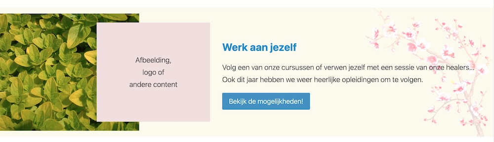
The basic idea is a background color, an image on the left, a second image (or content) that partially overlaps the left image, a content (text) box for the message, and an image on the far right as a background for the content.
This is created with Kadence blocks instead of Greenshift blocks. This is because Kadence is better for this kind of lay-outs; their row block is really ingenious in use and keeps its simplicity at the same time.
The example is shown here in full width, but it can of course also be in any other width. Please note that on mobile, only the content of the right column should be visible. The tablet version is not adapted in this example.
image,
logo or
other content
logo or
other content
Work on yourself
Take one of our courses, or treat yourself to a session with our healers… This year we again have wonderful courses to attend.
De afbeelding hieronder toont de hele lay-out, zoals het er op desktop uitziet.
The structure in detail
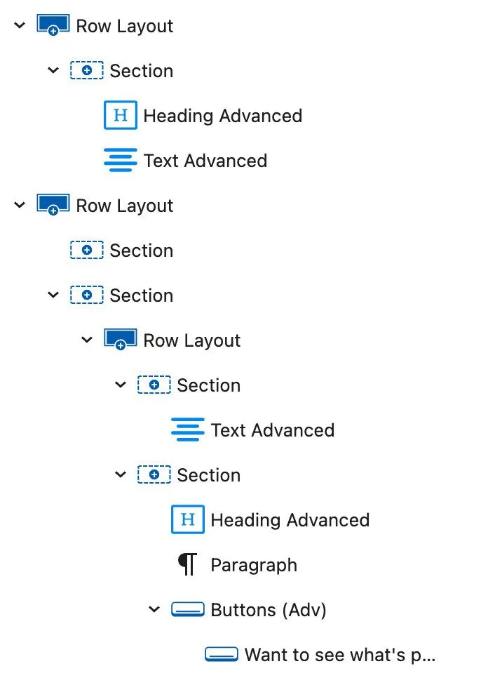
- The background color is determined in the 1st Row layout.
- The image with the leaves is a background in the 1st section of the 1st Row layout.
- The pink color (or image) with the overlap is in the 1st section of the 2nd Row layout. This section has a negative margin of 85 px on desktop; you can adjust this, depending on the overlap you want. On mobile, this is set to not show.
- The content (heading, body text and button) is in the 2nd section of the 2nd Row layout.
- The image on the right is as background in the 2nd section of the 2nd Row layout.
- You can make the entire layout a bit higher, by giving the 2nd section of the 2nd row, some padding above and below.
- Once you know it, it’s simple.
- Important: each builder has a similar block, it is then called columns, sections, rows or something like that. However, not all of these behave the same. The Row block of Kadence blocks is very predictable, never gets ‘confused’ and is therefore very useful for this.