
Centered odd number of columns
Centered odd number of Kadence columns
It is easy to create a few columns in a row. The problems begin when each row contains a different number of rows, and you want to center them. It all depends on the purpose and style of the webpage. A standard grid usually does not need this centered column design. Websites focused on design, fashion, etc., often do require centered columns.
Easy-peasy
I will show you two examples: the ‘standard’ row and column situation and the solution. Both were created with Kadence Blocks. Kadence offers the right ‘flexbox’ possibilities to create this.
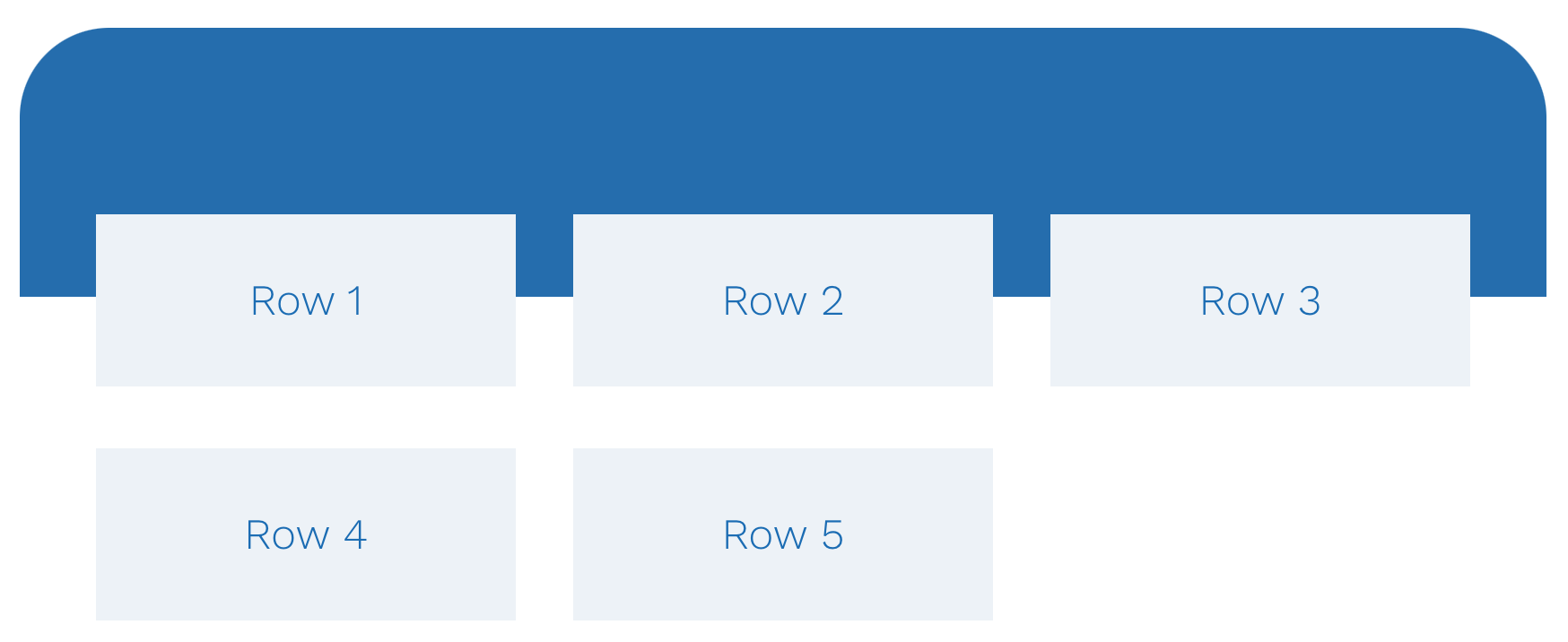
The standard column layout
- First row:
- Blue background
- Only 1 section.
- Second row:
- With 3 columns
- 5 sections
- Issue: the second row of columns is never centered.
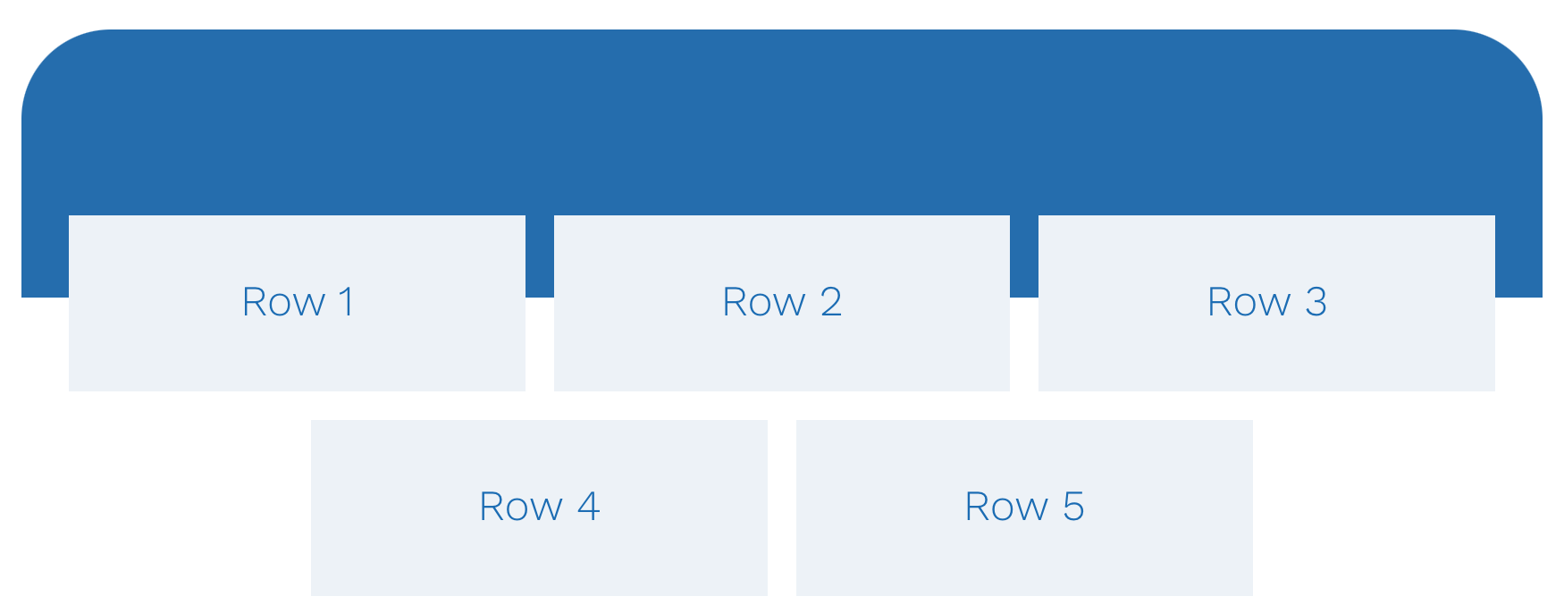
Centered column layout
- First row:
- Blue background
- Only 1 section.
- Second row:
- Only 1 section
- With 3 columns
- 5 sections placed within the single section
- Each section has a maximum content width between 27-32% (it is important that the 100% is divided into 3 so that you have a turning point)
- The single section must meet the following requirements: horizontal orientation, centered alignment, and the addition of a small vertical opening.
- Set the Wrap content to ‘wrap’.
- You are done; you have a centered column layout that adapts perfectly to any screen and any orientation.
- Advice: Ensure that you set the maximum content width for the centered columns on mobile to 60-90%, depending on your design.
- Your tablet settings depend on the breakpoint settings you have configured.
In the document overview

Additional explanation
- At the top, you see the first row with a blue background.
- The bottom of the first row is set to a negative margin of 70px.
- The second row contains the single section.
- The single section contains the other 5 sections.
- Each of the 5 sections has a gray background.
- Each of the 5 sections contains a simple header.
- Don’t forget to set all 5 sections to grow: 2.
Special thanks to: Michelle Nunan, Paul Adamson and Lynette van der Merwe.