
Flexible Layout Section for Gutenberg
The intelligent Flexible Layout Section block for Gutenberg
The ideal replacement for the row block, div or group block
Gutenberg and the editor in general are getting better and better. What many users are missing is a better, more flexible and easier-to-use section block.
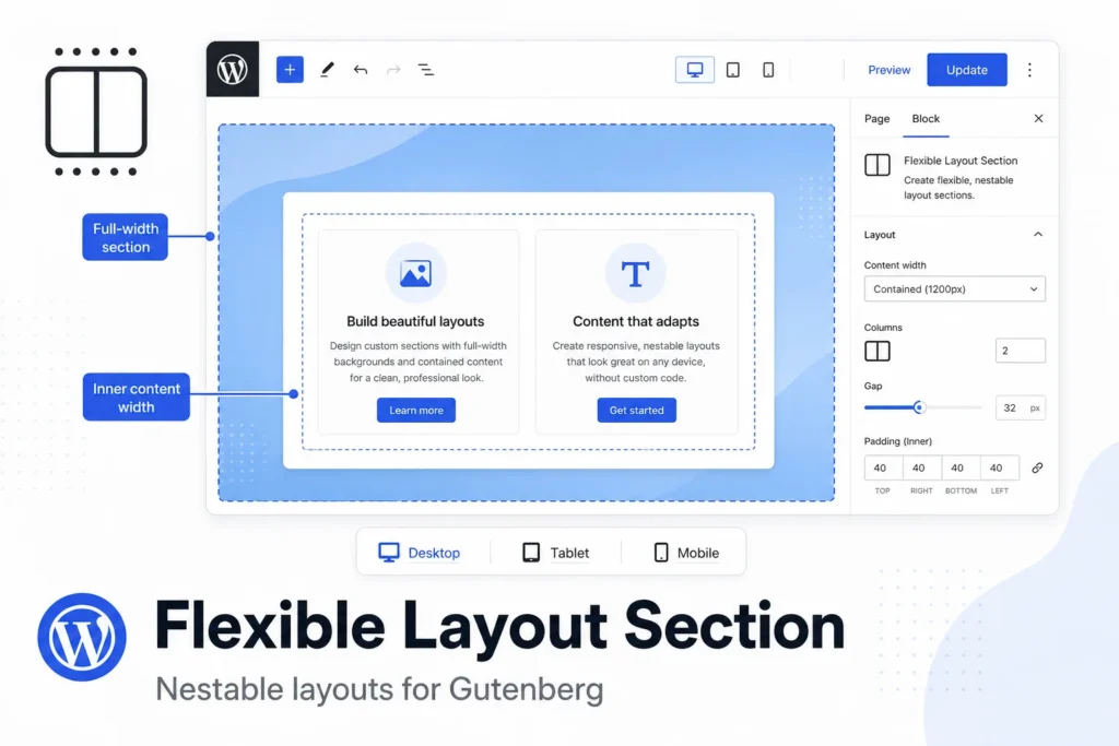
Meet the Flexible Layout Section plugin!
The Flexible Layout Section is a nestable container block for page sections — full-width backgrounds with controlled inner content width, responsive layout types, and spacing that stays predictable when blocks are nested.
4 Layout Types
1) Flow
- Default vertical stack — like a normal document flow. Best for hero sections, text blocks, and simple stacked content.
- Button to create stacked sections.
- Choose inner content width.
2) Flex row
- Horizontal layout: inner sections side by side.
- Option to give all inner Flexible Layout Sections in a row equal height.
- Child width controls how wide each nested section is per breakpoint (mobile defaults to full width).
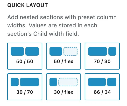
Flex row quick layout presets
- Flex row provides several preset lay-out options.
- Quick layout is only visible if the main section is still empty; to protect existing content.
- Every selected preset sets the necessary number of inner flexible lay-out sections and stacking on mobile.
- 2 columns 50% / 50%
- 2 columns 50% / flex (stretches to fill the available space)
- 2 columns 70% / 30%
- 2 columns 30% / 70%
- 2 columns 30% / flex (stretches to fill the available space)
- 2 columns 66% / 34%
3) Flex column
- Vertical flex layout with alignment controls. Like the Flow layout type, but with more flex controls.
- Horizontal alignment positions items left, center, right, or full width.
- Vertical alignment controls distribution along the column (top, middle, bottom, stretch, space between, and similar). Reverse order flips the visual order of children.
Flex column quick layout preset
- Flex column provides various preset lay-out options.
- Quick layout is only visible if the main section is still empty; to protect existing content.
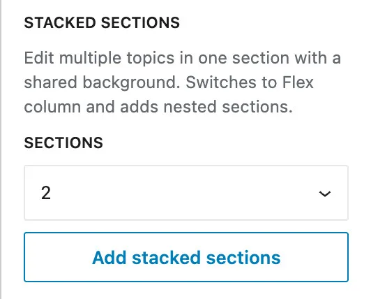
- Ideal for Editing multiple topics in one section with a shared background.
The selected sections set the necessary number of inner stacked flexible lay-out sections.
- Add 2 flexible layout sections
- Add 3 flexible layout sections
- Add 4 flexible layout sections
- Add 5 flexible layout sections
- Add 6 flexible layout sections
Push last block to bottom
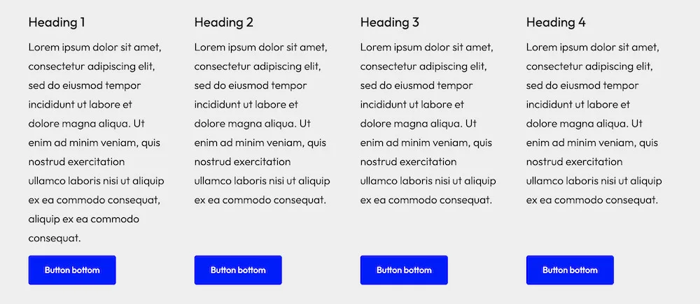
- Flex Column has an option that will make every designer happy: ‘Push last block to bottom’.
- The last block in a column is then assigned a margin:auto value and ‘sticks’ to the bottom of the column. This is ideal for columns with uneven content (such as text) that you want to be aligned at the bottom, like a button, a disclaimer, or anything else.
- Important: this is only useful if there are several Flex Columns placed in a Flex row section.
4) Grid
- CSS grid with a configurable number of columns.
- On smaller viewports you can override columns per breakpoint, so content reflows cleanly.
- Set child width per device, so content reflows cleanly.
- Toggle to insert a section in every column.
- Mobile order # sets the stacking order on mobile.
- Flexible layout sections in a grid always have equal height – automatically.
- Designing nested sections with a bento layout is incredibly easy because there is only one type of section; parent en child are the same and equal height is respected in all designs.
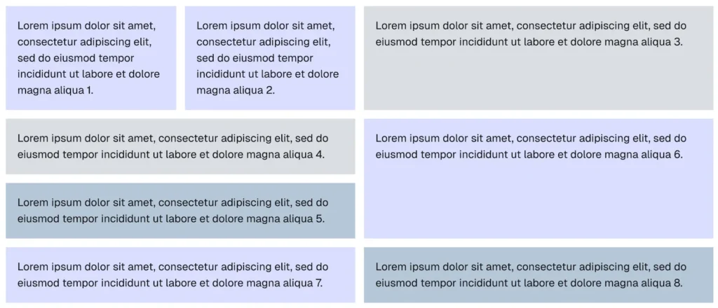
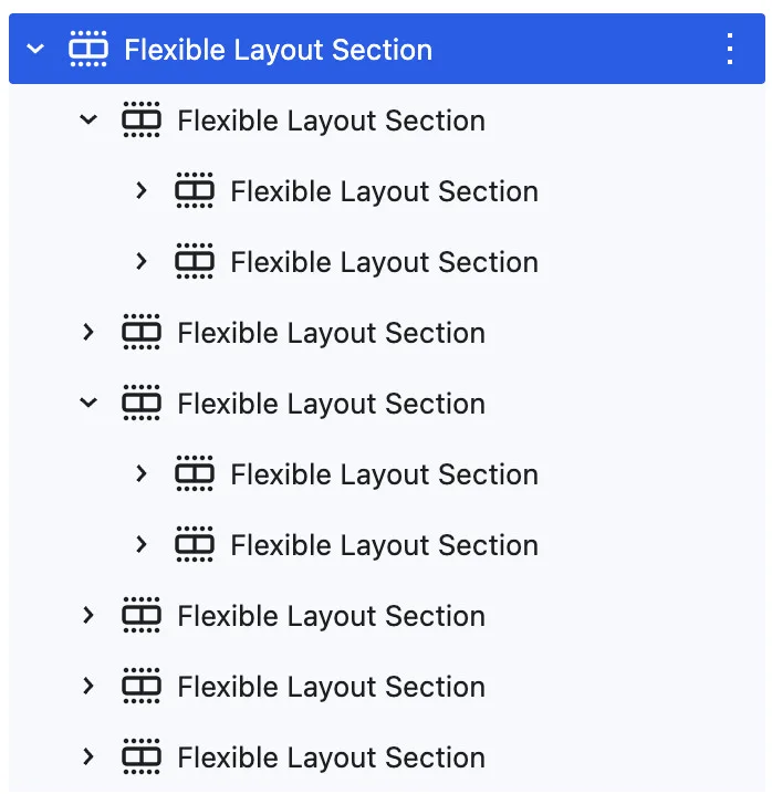
Push last block to bottom
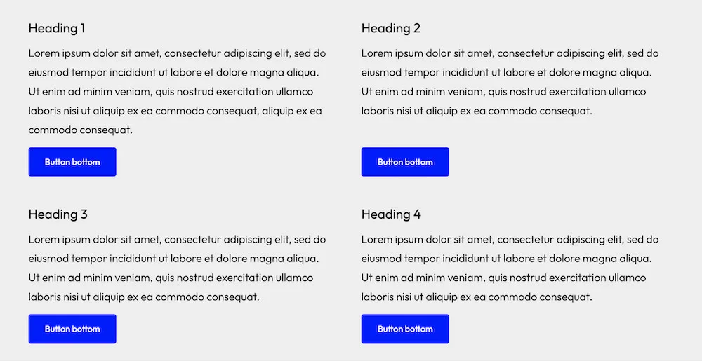
- Grid also has an option to align the last block: ‘Push last block to bottom’.
- The last block in a grid column is then assigned a margin:auto value and ‘sticks’ to the bottom of the column. This is ideal for columns with uneven content (such as text) that you want to be aligned at the bottom, like a button, a disclaimer, or anything else.
FAQs Flexible Layout Section
The Flexible Layout Section plugin is expecially developed for Gutenberg. It gives your website – even when using core blocks – professional possibilities, without using a builder.
The group block is an excellent block. It’s just not enough for most users and certainly not userfriendly. Did you ever try to create a grid of 2 or 3 columns, wide-width with a full widh background?
Flexible Layout Section really gives you professional features. A background with an image? Of course. You want to add the image through a custom field? No problem. You need to give every column an overlay link that points to a certain URL? Build-in.
You need conditions to show or not show the section? Maybe even based on a custom field? Build-in.
Yes you can. Flexible Layout Section has been designed to work with every well build block. The core query, accordion, our accordion block, maps, video, even place a group, or cover block with a video background, you can use them all.
Yes, there is. The documentation answers qustions like this and many more.
This is build in. You can use reverse order, or give every child section a order-nr; lower is shown first.
Overpromising is never a good idea, but we tested the block on several themes, both classic and FSE and we made sure there weren’t any issues. The plugin works according to WordPress conventions, with manual custom overrides.
I you mean combining the Flexible Layout Section block with other WordPress Gutenberg builders like Kadence, GenerateBlocks, Greenshift, Greenslight and Stackable; yes you can. We tested the most sensitive combinations like the Flexible Layout Section with maps, accordions, tabs blocks, popups, video blocks and queries from those builders.
On the Settings page you can set:
- Default custom max width
- Default padding
- Default margin
- Tablet breakpoint
- Mobile breakpoint
These settings apply to all new Flexible Layout Sections and to any existing Flexible Layout Sections that do not have custom block settings.
Also read the FAQ about the theme width settings.
We build the block with modern standards. Accepted are:
- px
- %
- em
- rem
- vw
- vh
- ch
- Plain numbers become px
What we did is follow WordPress standards, so most FSE (full site editing) themes will be fine.
We did something better though: on the settings page you can see the found width settings of your theme and set your personal preferred width for content, wide-width and default custom max width.
Every Flexible Layout Section, including all inner sections, have a separate width setting: theme content (none), theme wide with, full width and custom width.
Width settings on the settings page
The settings page displays the detected theme width, if available, although this may not always be the case, particularly with classic themes. However, you do have the option to set custom values for:
- Theme content width (none)
- Theme wide width
This ensures that the widths you use match those defined in your theme. Flexibility is important.
Lots of people use it and are no expert. Flexbox is wonderful and can be annoying at the same time.
What we did is integrate flexbox in the settings, but in an easy way. Lots of times you don’t even realize you are working with flexbox and yet you are…
Even if you have no idea what flexbox is, there is no need to worry. Flexible Layout Section just works and we offer you several presets that create the columns, or grid with columns for you.
We know a lot of section blocks, row blocks, columns blocks, div blocks, and worked with several of them for many years. Some are good, some not so. Some are good but difficult to work with, while others are easy to work with but don’t always work as expected. A good section block is one of the mosts difficult to create!
The ‘flexible layout section’ block for Gutenberg is what we – as website builders and designers – expect from a good section block. We love Gutenberg, but their group and colums block is sometimes, well… not what we want or need.
In a way, yes. The names mean sort-off the same. But different names give different expectations. A div block can be super simple, while a row block already promises more than that.
That’s why we choose the name Flexible Layout Section. It is a div, but flexible, gives you al kinds of lay-out options and is a section block, with a grid, columns and everything.
Yes. Flexible Layout Section has excellent presets.
Flex row has several presets to create columns. Flex columns has presets to create a series of stacked sections in one parent section, with a shared background.
Grid has adjustable columns and a button to automatically place a section in each column.
To ensure that content is not overwritten, most presets are visible only if the parent section is still empty. Grid allows you to use the ‘place sections button’ as much as you want and keeps adding sections.
Grid layouts always have equal height. Automatically.
Flex row has an option ‘Stretched (equal height) that does the same.
WPINSIGHT develops plugins and blocks for web builders, and personally, we prefer uniform columns that maintain the same height for a more polished look.
Flexible Layout Section compared to other row, section, container, column blocks
For Core Gutenberg
- It works many times better and easier than the Group block
- In almost all cases better than the Core Columns block
- It has settings per device (desktop, tablet, mobile)
- Super handy preset settings
- Being able to use custom fields for backgrounds and overlay target.
For Greenshift
- The Greenshift Row block crashes on several FSE themes (Ollie for example). In that case, use the Flexible Layout Section.
- Although Greenshift’s Row block is good, Flexible Layout Section works easier and faster.
GenerateBlocks
- GenerateBlocks has a good container/section block. However, it is anything but user-friendly and has no presets.
Twentig builder
- Twentig is an amazing simple but effective builder. The disadvantage is that they still use the (extended) core group- and column blocks.
- Flexible Layout Section gives you an amazing workflow compaired to the core blocks.
- Being able to use custom fields for backgrounds and overlay target.
PostX
- PostX has issues with columns on classic themes. use Flexible Layout Section and the issues are gone.
Yes, the Flexible Layout Section block has two kinds of visibility settings: devices (desktop, tablet, mobile) and conditions, like taxonomy (categories, terms), content of custom fields, and logged-in versus logged-out.
The outcome of the condition (show or no show) is visible on the block itself through a green (show) or red (no show) icon.
Many seek an alternative for the Gutenberg Group block
The Flexible Layout Section block is the perfect alternative for the group block. In most cases also for the column block, becasue we have build-in flexbox and grid.
Yes it does. In my experience the Greenshift blcoks do work on the Ollie theme, except one, the most important one: the row block. That incompatibilty was the main reason WPinsight developed the Flexible Layout Section plugin.
Site-wide defaults (Settings tab)
Did you ever get tired or even annoyed because you had to set everything again?
The Flexible Layout Section plugin gives you preferred settings:
- Default custom max width — fallback for custom inner content width.
- Default padding — applied to all sections unless overridden in the block.
- Default margin — applied to all sections unless overridden in the block.
- Tablet and mobile breakpoints — control when responsive overrides and Order mobile take effect.
- Root-padding compensation (desktop, tablet and mobile).
- Default gap (space between inner sections)
Those settings apply to every new and existing Flexible Layout Section and are easily overridden by the block settings. The settings page is secured and accessible only to the website admin. This prevents another user from changing the settings, which could cause the layout of not only new but also existing sections to change completely.
Other Flexible Layout Section plugin features
Gap
- Spacing between direct children inside the inner content area. When a parent uses Gap, nested children automatically have their own block margins cleared so spacing is not doubled. Set vertical and horizontal gaps separately; values can differ per device.
Inner content width
- Inner content width controls how wide the content area is inside a section. The outer section can still be full width (background, padding); the inner area is where your blocks sit.
- Theme — follows the theme content width.
- Wide — theme wide alignment width.
- Custom — your own max width per breakpoint (defaults come from Settings on this page). Full — inner content spans the full section width.
Custom inner content width
You can set your personal preference on the settings page. Those values are used as a fallback when your theme doesn’t follow WordPress conventions for the width settings or cannot be found. You can even force the plugin to use those custom values.
- Theme content width (none)
- Theme-wide width
- Custom max width
Child width (flex row only)
- When this block is a direct child of a flex-row parent, you can set its width per device — for example 50% on desktop and 100% on mobile.
Compensate root padding
- Compensate root padding insets in the full-width shell, so the content edges of a full-width section match the wide width.
- With the toggle on, spacing left and right stays 0 (compensation is the horizontal inset).
- Turn the toggle off to use the default left right padding when a background is set.
- Set in Settings → Flexible Layout Section. Site values vary per theme and them,e settings, like: 45px / 35px / 30px.
Order on mobile
- Visible on the mobile device tab only. Lower numbers appear first when flex items stack on mobile, without changing the desktop or tablet order.
Margin, padding, background, border
- Standard Gutenberg controls on the outer section wrapper. Backgrounds and padding apply to the full aligned width; inner content width constrains the blocks inside.
Sections and padding
The Flexible Layout Section block applies padding in a simple, predictable way so content stays readable on every device — including mobile and tablet.
- The site default is 20px on all sides (configurable under Settings → Flexible Layout Section → Settings). Unless you change it, every section — outer sections and nested inner sections — gets that padding on top, right, bottom, and left.
- Inner content width (theme content width, theme wide width, or full width) controls how wide the content column is inside the section. It does not turn padding on or off. Padding always applies to the outer section wrapper; the inner area sits inside that padded box.
- Theme content width (none) — content is limited to the theme’s normal column width and centered inside the padded section.
- Theme wide width — content uses the theme’s wider column width, still centered inside the same padded section.
- Full width — the inner content area fills the space available inside the outer padding (edge-to-edge within the section, not the viewport).
- Nested sections (for example in a flex row 70/30 layout) each have their own padding. By default, nested sections in flex row or grid use full inner width so columns fill their slot correctly.
- Remove horizontal padding — in the block sidebar under Gap, you can use the Remove horizontal padding toggle: it sets the left and right padding to 0 for any section (outer or inner). Turn the toggle off to restore default padding on all sides.
- Adding or removing a background does not change padding automatically. Backgrounds span the full aligned width of the section; default padding insets the content on all sides regardless of background.
- You can override padding at any time in the block Styles panel. After a manual change, spacing stays custom until you adjust it yourself. Use Remove horizontal padding when you want a quick way to drop side inset without editing each side manually.
Visibility
- The Flexible Layout Section has 2 kinds of visibility settings.
Visibility device
- You can choose to show or hide on desktop, tablet, and mobile.
- Both the Grid and Flex row recalculate the width when a grid-item or Flex row item is hidden and reflow.
Visibility conditions
- The Flexible Layout Section has conditions based on: taxonomy (category / terms) or custom field.
- The compare types are: not empty, empty, true, false, equals, logged in, logged out, contains, and doesn’t contain.
- In the editor, every section with a condition shows a green (show) or red (no show) indicator icon.
Inner section settings
- When you created a complete section layout, or even an advanced bento layout and you want to change some visual aspects of the inner sections, like background color, border width, border color or even the corner radius. Ypi can do this one by one or use the ‘Inner section settings.’ Activating it shows a small popup; you enter the values and click on Apply. Done, all at once. Empty values are not applied, so existing settings are kept.
Overlay link
- The overlay link makes the whole section clickable (targets to a URL you enter) while inner links and buttons stay usable.
- The overlay link also works with Dynamic URL (custom fields like ACF, SCF, ACPT, Meta Box and Modern Fields).
Dynamic background image
- Built into this block — no extra plugin required.
- In the block sidebar under Color, enable “Use custom field / dynamic image” and choose a source: URL (with tokens such as {meta:field_key}), attachment ID, or post meta field key. The meta field can return an image URL or a Media Library attachment ID — from ACF, Meta Box, ACPT, Modern Fields, or any plugin that stores the value in post meta.
Free
$ Free
Conclusion: good start
- Totally free
- Unlimited websites
- Flow, flex, grid, gap
- Child width
- Nesting
- Custom width (desktop and inherit)
- Minimum height (desktop and inherit)
- Media Library background
- Perfect simple websites
- Good Group block replacement
- Compatible with query, group block, columns, video, accordion, etc.
You are missing
- Min. height per device, visibilty, conditions, overlay url, dynamic background, support, automatic updates

Flexible Layout Section
$ 29 Essential
Conclusion: good choice
- One-time payment (LTD)
- All the features in the free version
- Activation on 5 websites
- Tablet/mobile custom width
- Min-height tablet/mobile
- Dynamic background + meta (custom field) picker
- Hide on device (desktop, tablet, mobile)
- Conditional display (logged status, taxonomy, custom field content)
- Overlay link + meta (custom field) picker
- Sticky
- Automatic updates
- Support
Flexible Layout Section
$ 49 Agency
Conclusion: excellent choice
- One-time payment (LTD)
- All the features in the free version
- Activation on 25 websites
- Tablet/mobile custom width
- Min-height tablet/mobile
- Dynamic background + meta (custom field) picker
- Hide on device (desktop, tablet, mobile)
- Conditional display (logged status, taxonomy, custom field content)
- Overlay link + meta (custom field) picker
- Sticky
- Automatic updates
- Support
All-in plugin pack
50% Discount
Conclusion: best choice
- Activation on 25 websites
- Gives Gutenberg professional features
- Perfect with Stackable, GenerateBlocks, Greenshift, GutenKit and more
- All plugins are for classic and FSE themes, except FSE Template Assigner
Select 5 plugins
- Dynamic OSM Maps
- Dynamic Popup & Flyout
- Dynamic Accordion
- Dynamic Video Player
- Flexible Layout Section
- FSE Template Assigner
Discount:
- Add plugins totaling at least $245 and apply the 50% discount coupon (ALL-IN-PLAN) for half off