
Documentation Dynamic Popup & Fly-out plugin
Documentation for the Dynamic Popup & Fly-out Plugin
A Gutenberg block popup and fly-out panel that opens from any element via a CSS selector.
The Dynamic Popup & Fly-out plugin adds a block that creates pop-ups and fly-outs (side-modals) that work like a column: You can put any WordPress blocks inside the panel. The panel itself has no fixed content — only your blocks.
Features
- Inner blocks support — add paragraphs, images, buttons, forms, etc.
- Trigger via CSS class or ID selector
- Placement: right, left, top, bottom, top center, bottom center, or center
- Responsive width: desktop, tablet, and mobile (with inherit)
- Width and height in px, %, or auto (auto height available when not using left/right)
- Z-index control of both the whole panel and the close button (separately)
- Background color, padding (top, right, bottom, left), and margin (top, right, bottom, left) in px or %
- Backdrop color and opacity (%)
- Extra CSS field for panel and backdrop styling
- Choose the placement of the close icon; top=left, top-right, or hidden
- Frontend script loads in the footer for reliable header/menu triggers and better behavior in row blocks from Kadence and other classic themes
- Placement of the block in the footer (or header) is possible; that way you can use the popup on every page with that footer
- Close by clicking the × button, clicking the backdrop, pressing Escape, or clicking the trigger again
CSS target by ID
- You can apply general CSS; this modifies all modals (pop-ups, fly-outs, etc.) at once.
- You can target each modal individually. For this, you require the modal ID. For each modal, the ID is listed in the block settings, ready for use.
Usage
- Go to Admin / Popups & Flyouts
- Create, duplicate or open an existing popup or flyout.
- In the meta box, set the trigger selector (example: .flyout-trigger or #open-panel)
- Add blocks inside the Dynamic Popup & Fly-out block — they appear in the fly-out on the frontend.
- On any other block or in your theme, add the same class (without the .) or ID to a button, link, or menu item.
- You can even switch Popups & Flyouts on and off.
Trigger class or ID
Class as a target to open
If you are going to use a class as the open modal trigger:
- Set a .class-name in the Trigger selector at the block settings.
- Example: .open_price_modal
- Place a trigger element on the page, template or menu you want to be used by the visitor to open the modal.
- Go to the Additional CSS class(es) and set the same trigger (. period not necessary here).
- Example: open_price_modal
- If you would like to have the mouse pointer change to the openhand icon on hover over the trigger element, add this CSS to that element:
- cursor: grab;
- Save the page or template, refresh and test.
ID as a target
If you are going to use an ID as the open modal trigger:
- Set a #ID-name in the Trigger selector at the block settings.
- Example: #open_price_modal (don’t use the . period, but a #hash).
- Place a trigger element on the page, template or menu you want to be used by the visitor to open the modal.
- Go to the HTML Anchor section and set the same trigger (# not necessary here).
- Example: open_price_modal
- If you would like to have the mouse pointer change to the openhand icon on hover over the trigger element, add this CSS to that element:
- cursor: grab;
- Save the page or template, refresh and test.
Example HTML in a Custom HTML block or theme
- <button type=”button” class=”flyout-trigger”>Open panel</button>
Class as a target to close the popup or flyout
If you are going to use a class as the close modal trigger:
- Set a .class-name in the Trigger selector at the block settings.
- Example: .close_price_modal
- Place a trigger element on the page, template or menu you want to be used by the visitor to open the modal.
- Go to the Additional CSS class(es) and set the same trigger (. period not necessary here).
- Example: close_price_modal
- If you would like to have the mouse pointer change to the openhand icon on hover over the trigger element, add this CSS to that element:
- cursor: grab;
- Save the page or template, refresh and test.
Don’t target a specific popup in the block CSS
What works and what doesn’t
No separate selectors in that field — only properties for the panel.
| Value | Effect |
|---|---|
border-radius: 8px; | Within the panel itself ✓ |
background: #111; | Within the panel itself ✓ |
.super-modal__close { color: #333; } | Becomes #super-modal-abc123 { .super-modal__close { … } } — nested CSS; works in modern browsers only, not stable everywhere ✗ |
Installation
- Upload the ‘Dynamic Popup & Fly-out’ folder to /wp-content/plugins/.
- Activate the plugin through the Plugins menu in WordPress.
- Add the Dynamic Popup & Fly-out block to a page.
- Set a trigger selector in the block sidebar.
- Add that class or ID to any element that should open the panel.
Use a menu item as a trigger
- Set the modal to footer.
- Add a CSS class to the menu item in **Appearance → Menus** (enable CSS classes under Screen Options if needed)
- Use that class as the trigger selector.
Auto-open delay
- Dynamic Popup & Fly-out plugin also offers an auto-open delay option.
- It works in ms, so 3000 is 3 seconds.
- You don’t have to choose between a trigger and an auto-open delay: you use one of them or combine them.
- After xxx milliseconds the auto-open delay will fire, and the visitor can click on the usual trigger like a button or image.
- If the panel is already open when the delay fires, it stays open.
- If multiple modals auto-open, the latest one closes the others (same as manual open).
- Note: it doesn’t work with cookies, so there is no way to prevent the visitor from seeing the popup twice; after a click and with an auto-delay, but the auto-delay will not open when the popup is opened manually.
- Use 0 to disable the auto-open delay.
A real example of creating a modal
Step 1: Install Dynamic Popup & Fly-out
- Install the Dynamic Popup & Fly-out plugin.
- Enter the license key and save.
Step 2: Create the modal
Placement of the Popup or Fly-out
- Go to Admin / Popups & Flyouts
- Create, duplicate or open an existing popup or flyout.
- Add blocks inside the Dynamic Popup & Fly-out block — they appear in the fly-out on the frontend.
Trigger
- Choose a trigger selector.
- Example: .modal-prices-services (don’t forget the . at the beginning)
Output location
- Select the Output location: ‘On the page’ or ‘Footer (site-wide)’***.
- If you are creating a modal that’s going to be opened from a menu, like an information or support form, select Footer.
- If you use a modal on a certain page only, select ‘On the page’.
*** Don’t forget to place the block in the footer or another global element for site-wide usage. If you place different footers on different pages, don’t forget to place the Dynamic Popup & Fly-out block in every footer, or use another global element if available.
Placement
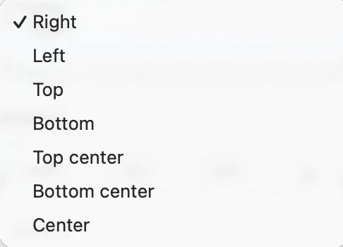
- Choose placement teh placement for your modal.
- Right means ‘stuck to the right side’, center (not bottom center) really means the vertical en horizontal center.
- The placement you select also defines the direction of the sliding. If you select Right, the modal will slide in from the right.
Width
- Set a width for every device; dekstop, tablet and mobile.
- The width can be set in % or px.
- For a normal fly-out, 450 to 500 px is good. On mobile you might set it to be 400px.
Height
- Set a height. This is universal for all devices.
- The height can be set in % or px.
- If you like a modal like a flyout, set the height to 100%
- If it’s more like a popup, Auto might be best. Auto means it will adjust the height according to the content.
Add your blocks
- Add the blocks you need in the modal
- The Dynamic Popup & Fly-out block plugin supports all core blocks and during our tests all other Gutenberg blocks.
- Tested with core, Kadence blocks, Greenshift and Greenlight blocks.
- If you have custom fields on your site, you can use them in Dynamic Popup & Fly-out.
- Save.
Z-index
- Z-index is only important if you see that the modal disappears, completely or partly, under another element like a menu, a heading. WordPress works in layers and every layer has a number. Z-index 5 is ‘higher’ than z-index 1. So if that happens, just give your modal a higher z-index. Try 5 or 10 to start with. Don’t go too high, because your website might have other elements that need to go over the modal, such as a menu.
- You can set the z-index of the close button separately. This is because some elements, like the WooCommerce side-cart, tend to overrule everything, so we gave our close button a higher z-index. You can change this anytime in the block settings.
Appearance
- This is the design part with background, padding, margin, backdrop color, and backdrop opacity (transparency). You can leave them as they are and change settings later.
- Within Appearance there is also ‘Panel ID’. The panel ID is only essential if you are using special CSS to target the modal. If you set a color or an effect, that shouldn’t apply to all objects or modals on your page, or even your entire website. That is why Dynamic Popup & Fly-out has a unique ID for every modal.
- Also within Appearance is ‘Extra CSS this modal’. All CSS placed in that field only applies to this specific modal.
- We provide you with a code we personally like. It gives the background a subtle blur when the modal opens.
/* backdrop */ backdrop-filter: blur(2px); -webkit-backdrop-filter: blur(2px);- Just place the code and save.
Step 3: Create the trigger
Place an element on the page
- Anything can be a trigger for the modal. A text, a button or even an image. The procedure is the same.
- As an example we place a button. It can be a button from any Gutenberg collection or core.
- Place a button.
- Give the button some text, like ‘Prices or our Services’.
Add the trigger to the placed element
- Go to the field ‘Additional CSS class(es)’
- Place the same class you used before, but without the .
- In this example: modal-prices-services
- Save.
Step 4: Check the result!
- As you see, it’s super simple with Dynamic Popup & Fly-out.
Special settings (optional)
Everything after this heading is optional and is only listed here to help you further if you ever need it.
Change the color of the close icon
- Use this class: .super-modal__close.
- That’s the close button (the ×). The icon inherits its color from the button via color: inherit, so usually setting color on the button is enough.
Example (theme / Customizer CSS)
.super-modal > .super-modal__close {
  color: #ffffff;
  background: rgba(255, 255, 255, 0.15);
}

.super-modal > .super-modal__close:hover,
.super-modal > .super-modal__close:focus {
  color: #ffffff;
  background: rgba(255, 255, 255, 0.25);
}
#super-modal-abc123 .super-modal__close {
color: #333;
}#super-modal-abc123 .super-modal__close {
color: #333;
}Scope to one modal only
- Each panel gets a unique ID like #super-modal-abc123
- Inspect the panel in the browser to find its ID
#super-modal-abc123 .super-modal__close {
  color: #ffffff;
  background: rgba(255, 255, 255, 0.15);
}
CSS for the close icon for a specific modal
#super-modal-abc123 .super-modal__close {
  color: #333;
  background: rgba(0, 0, 0, 0.06);
}

#super-modal-abc123 .super-modal__close:hover,
#super-modal-abc123 .super-modal__close:focus {
  color: #333;
  background: rgba(0, 0, 0, 0.12);
}

Note:
Replace abc123 with the Panel ID from the block sidebar (Appearance).
Extra CSS field in the block itself
- That field wraps rules on the panel root (#panel-id { … }), so a selector like .super-modal__close { color: … } won’t work there.
- For the close icon specifically, use Appearance → Customize → Additional CSS or your theme stylesheet instead.
Example
#super-modal-abc123 .super-modal__close {
  color: #333;
}
Cache settings for the Dynamic Popup & Fly-out block
- You don’t need any special settings for cache. The Dynamic Popup & Fly-out block has been tested with many themes like Kadence, GeneratePress, Neve FSE, Greenshift, Ollie, and Raft. It has been tested (on those themes) with several cache plugins, like LiteSpeed, WPCompress and FlyingPress.
Speed-impact / size
The plugin loads only on pages with a Dynamic Popup & Fly-out block (with trigger enabled). No block → no extra assets.
| Asset | Unminified | Gzip (typical compression) |
| frontend.js | 6,1 KB | ~1,8 KB |
| frontend.css | 4,6 KB | ~1,1 KB |
| Total | ~10,7 KB | ~2,9 KB |
Practical: very lightweight (compressed only ~2,9 KB). No jQuery, no external requests. The script is located on the page or in the footer and only initializes after DOMContentLoaded. On pages without a modal: 0 KB extra.
Floating button creation
A floating button can be handy. To open a flyout, a popup with an information form, or similar. If you don;t know how to create one of a bit unsure; read the complete manual on how to create a floating button (or another floating trigger) on any classic or full site editing (FSE) theme. Including the necessary CSS.