
Documentation Flexible Layout Section block for Gutenberg
Flexible Layout Section block
Use case of the Flexible Layout Section plugin
The Flexible Layout Section is a nestable container block for page sections — full-width backgrounds with controlled inner content width, responsive layout types, and spacing that stays predictable when blocks are nested.
Layout types
- Choose a direction / layout type in the block sidebar.
- Each type can have its own tablet and mobile overrides via the Desktop / Tablet / Mobile tabs.
- See the descriptions of flow, flex row, flex column and grid.
1) Flow
- Default vertical stack — like a normal document flow.
- Best for hero sections, text blocks, and simple stacked content.
- Use Gap to control vertical spacing between child blocks.
2) Flex row
- Horizontal layout: children sit side by side.
- Use Horizontal alignment (Left, Center, Right, Stretch), Vertical alignment, Wrap, and Reverse order.
- Stretch makes nested Flexible Layout Sections equal height in one row.
- Child width controls how wide each nested section is per breakpoint (mobile defaults to full width).
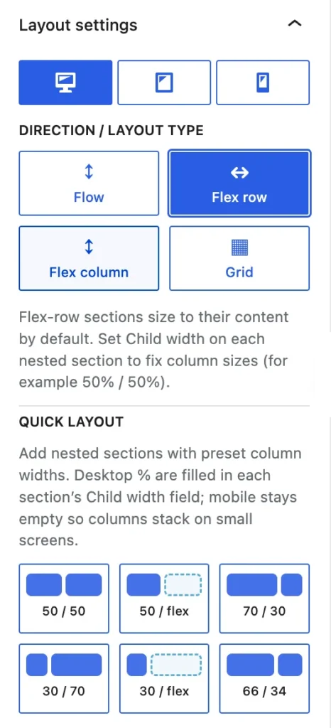
Flex row – Quick layout
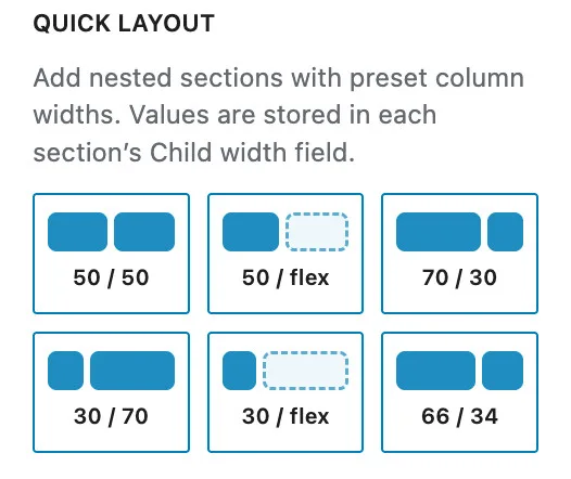
- Flex row layout has special Quick layout functionality.
- Every quick layout option adds the nessesay nested sections with preset column widths. Values are stored in each section’s Child width field.
- Quick layout is visible if the main Flex row layout is still empty; to protect existing content.
Available flex row quick layout options
- 2 columns 50% / 50%
- 2 columns 50% / flex (stretches to fill the available space)
- 2 columns 70% / 30%
- 2 columns 30% / 70%
- 2 columns 30% / flex (stretches to fill the available space)
- 2 columns 66% / 34%
3) Flex column
- Vertical flex layout with alignment controls. Horizontal alignment positions items left, center, right, or full width; Vertical alignment controls distribution along the column (Top, Middle, Bottom, Stretch, Space between, and similar).
- Reverse order flips the visual order of children.
Flex column – Quick layout
- The Flex column layout has special Quick layout functionality.
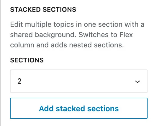
- Edit multiple topics in one section with a shared background.
- NOTE: If you are in Grid, it switches to the Flex column layout and adds the nested sections.
- Quick layout is visible if the main flexible column layout is still empty; to protect existing content.
- Every quick layout option adds the nessesay nested sections. Values are stored in each section’s Child width field.
- Choose the number of sections and click on ‘Add stacked sections’.
Available flex row quick layout options
- Flex Row quick layout offers the following options:
- Add 2 flexible layout sections
- Add 3 flexible layout sections
- Add 4 flexible layout sections
- Add 5 flexible layout sections
- Add 6 flexible layout sections
- Note: You can add as many sections as you like, the preset just stops at 6.
Push last block to bottom
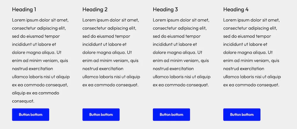
- Flex Column has an option that will make every designer happy: ‘Push last block to bottom’.
- The last block in a column is then assigned a margin:auto value and ‘sticks’ to the bottom of the column. This is ideal for columns with uneven content (such as text) that you want to be aligned at the bottom, like a button, a disclaimer, or anything else.
- Important: this is only useful if there are several Flex Columns placed in a Flex row section.
4) Grid
- CSS grid with a configurable number of columns.
- Toggle to insert a section in every column automatically.
- On smaller viewports you can override columns per breakpoint so content reflows cleanly.
- You can also specify the child width in pixels or percentages for each device (optional). If the combined width of the grid items exceeds 100%, excess items will wrap to the next line.
- Mobile order # sets the stacking order on mobile.
- Flexible layout sections in a grid always have equal height – automatically.
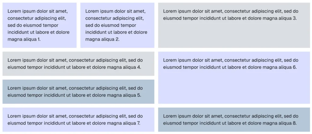
- Easy to create a bento-style grid: every child section can be a parent to other child sections. You can use flex-row within the grid (like nr. 1 and 2) and the equal height is always respected.
- You always start with a default grid of 2 or 3 columns. Every time you click on ‘Place sections in all columns’ you get an extra row of sections. In this example there were 3 rows.
- The next step is you click on one of the children (inner sections) you wish to use as a parent for other children, and you just add another Flexible Layout Section and choose the type (Flex-row or grid) and you are done.
- In this example, none of the block settings like gap, padding or margin, had to be adjusted; we just placed the sections, selected the style and picked a background color (optional), nothing else.
- The illustration shows both the frontend result and the internal section-structure: it’s really incredibly easy. On mobile, the whole design is stacking automatically.
Push last block to bottom
- Grid also has an option to align the last block: ‘Push last block to bottom’.
- The last block in a grid column is then assigned a margin:auto value and ‘sticks’ to the bottom of the column. This is ideal for columns with uneven content (such as text) that you want to be aligned at the bottom, like a button, a disclaimer, or anything else.
- This is set with a toggle at the parent Grid block.
Grid vs flex row?
- Grid and flex row both place nested sections side by side, but they handle column widths differently.
- Picking the right one avoids confusion when you want equal columns versus an uneven split such as 30% / 70%.
Grid = equal columns
- When you set a parent section to Grid with 2 columns, each direct child gets the same width — a 50% / 50% split. With 3 columns, you get three equal tracks (33% / 33% / 33%), and so on. The plugin distributes space evenly; there is no per-child width control in grid layouts.
- That is intentional. Grid is best when you want a fixed number of equal columns and clean reflow on smaller screens (for example 3 columns on desktop, 2 on tablet, 1 on mobile). Nested sections inside a grid do not show child width in the sidebar because grid column sizing is controlled by the parent’s column count, not by individual children.
Flex row = custom column widths
- For unequal splits — 30% / 70% or 40% / 60%, a fixed sidebar width in px, and similar — use Flex row on the parent section instead of Grid.
- Select each nested Flexible Layout Section and set Child width on the Desktop (and optionally Tablet / Mobile) tab. Accepted units: px, %, em, rem.
- Leave Child width empty on a sibling when you want that section to fill whatever space remains. For example, set the left section to 350px and leave the right section empty — the right column grows to fill the rest of the row.
Which layout type should I use?
- Equal columns (50/50, three-up, four-up) — Grid.
- Set the column count on the parent and override it per breakpoint if needed.
- Unequal columns (30/70, fixed sidebar, mixed px and %) — Flex row.
- Child width on each nested section.
- Flex row has quick settings.
- Stack on mobile
- Grid: set columns to 1 on tablet or mobile.
- Flex row: Use Child width 100% on mobile, or rely on the default full-width behavior when Child width is empty.
Block settings
Align
- The first thing most users set is Align.
- Align is not about the inner content width but the width of the Flexible Layout Section itself. The choice you make with Align also depends on whether you are going to use a full-width background or not.
- Width content cannot be wider than the width of the block itself, so your choice is leading for the content width.
Align None
- None assigns the Flexible Layout Section the default width set in the theme. If the theme values (as with most classic themes) are not inherited by the Flexible Layout Section block, it is the value set in the settings page.
- None is usually a px value between 645-800px.
Align Wide-width
- Wide-width assigns the Flexible Layout Section the default wide-width set in the theme. If the theme values (as with most classic themes) are not inherited by the Flexible Layout Section block, it is the wide-width value set in the settings page.
- Wide-width is usually a px value between 1200-1400px.
Align Full width
- Full width doesn’t limit the Flexible Layout Section block in any way. The width is everything from far left to far right.
- This is the width you choose to give your section a background that is the total width of your page.
Inner content width
- Inner content of a section, row block, group or div is one of the most important—and sometimes annoying— properties. This section explains how the Flexible Layout Section handles content width.
- The Flexible Layout Section plugin complies with WordPress standards, so Flexible Layout Section automatically works with the content widths of most FSE (Full Site Editing) themes.
- This is not always the case with classic themes; they often have their own way of handling content width. The theme then uses it’s container classes/variables, meaning a plugin, like the Flexible Layout Section, cannot retrieve those values.
- Below is the explanation of how the Flexible Layout section handles different situations.
Fallback values for classic and older themes
- Themes with no
theme.jsonand no layout CSS variables → you get 1200px / 1400px fallbacks, not the theme’s actual content width.
Flexible Layout Section & different width situations
- A fallback is nice and standard practice. We did something better though.
- On the settings page you can see the found width settings of your theme and set your personal preferred width for content, wide-width and default custom max width.
- Every Flexible Layout Section, including all inner sections, has a separate width setting: theme content (none), theme width, full width and custom width. Those values are based upon the theme widths or, when not usable, the fallback. But as soon as you set your preferences for the theme content (none) and wide-width, the width will be based on those values. Automatically and for all Flexible Layout Sections.
Overview of width settings on the settings page
The settings page displays the detected theme width, if available, although this may not always be the case, particularly with classic themes. However, you do have the option to set custom values for:
- Theme content width (none)
- Theme wide width
This ensures that the widths you use match those defined in your theme. Flexibility is important.
- Theme — follows the theme content width.
- Wide — theme wide alignment width.
- Custom — your own max width per breakpoint (defaults come from Settings on this page).
- Full — inner content spans the full section width.
Child width (flex row and flow in grid)
- When this block is a direct child of a flex-row parent or a grid, you can set its width per device.
- For example 50% on desktop, 50% on tablet and 100% on mobile.
- When creating a section layout with inner sections, the inner sections are set automatically to a mobile child width of 100% to allow stacking.
Order mobile
- Visible on the mobile device tab only. Lower numbers appear first when flex items stack on mobile, without changing desktop order.
Gap
- Spacing between direct children inside the inner content area.
- When a parent uses Gap, nested children automatically have the block margins cleared so spacing is not doubled.
- Set vertical and horizontal gaps separately; values can differ per device.
- Standard Gutenberg controls on the outer section wrapper. Backgrounds and padding apply to the full aligned width; inner content width constrains the blocks inside.
Overlay & background
Overlay link
- The overlay link makes the whole section clickable while inner links and buttons stay usable.
Overlay link with URL from a custom field
- The overlay link makes the entire section clickable while inner links and buttons stay usable. This functionality also works also with values from custom fields. Select Dynamic URL; choose the Post Meta field and enter the Meta field key.
- Use complete URLs: https://your-domain.com.
Dynamic background
- In the block sidebar under Color, enable “Use custom field / dynamic image” and select a source: URL (with tokens such as {meta:field_key}), attachment ID, or post meta field key. The meta field can return an image URL or a media library attachment ID.
- Works with custom fields from ACF, ACPT, Meta Box, Modern Fields, or any plugin that stores the value in post meta.
Sections and padding
- The Flexible Layout Section block applies padding in a simple, predictable way so content stays readable on every device — including mobile and tablet.
- The site default is 20px on all sides (configurable under Settings → Flexible Layout Section → Settings). Unless you change it, every section — outer sections and nested inner sections — gets that padding on top, right, bottom, and left.
- Inner content width (theme content width, theme-wide width, or full width) controls how wide the content column is inside the section. It does not turn padding on or off. Padding always applies to the outer section wrapper; the inner area sits inside that padded box.
- Theme content width (none) — content is limited to the theme’s normal column width and centered inside the padded section.
- Theme wide width — content uses the theme’s wider column width, still centered inside the same padded section.
- Full width — the inner content area fills the space available inside the outer padding (edge-to-edge within the section, not the viewport).
- Nested sections (for example in a flex row 70/30 layout) each have their own padding. By default, nested sections in flex row or grid use full inner width so columns fill their slot correctly.
- Remove horizontal padding — in the block sidebar under Gap, there is a toggle that sets left and right padding to 0 for any section (outer or inner). The values appear explicitly in the Styles panel. Turn the toggle off to restore default padding on all sides.
- Adding or removing a background changes inner padding automatically.
- Backgrounds span the full aligned width of the section; default padding insets the content on all sides regardless of background.
- You can override padding at any time in the block Styles panel. After a manual change, spacing stays custom until you adjust it yourself.
- Use Remove horizontal padding when you want a quick way to drop side inset without editing each side manually.
Padding by inner content width
| Setting | UI label | What it affects | Padding (default) | With “Remove horizontal padding” |
|---|---|---|---|---|
| none | Theme content width (none) | Inner column = theme content width (e.g. 740–960px), centered | All sides on the outer (each inner section has its own) | Top/bottom only; left/right = 0 |
| wide | Theme wide width | Inner column = theme wide width (e.g. 1200px), centered | Same — all sides | Same — top/bottom only |
| full | Full width (no constraint) | Inner column fills the space inside the outer padding | Top/bottom only | – |
| Full with background | Full width (no constraint) | Inner column fills the space inside the outer padding | Same — all sides | Same — top/bottom only |
Example of horizontal padding
- Nested sections (e.g. flex row 70/30)
- Each nested section is its own outer + inner pair. Each gets its own default padding (all sides). Nested sections in flex row/grid default to full inner width so columns fill their cell.
- PARENT (outer padding 20px all sides)
- └── INNER (flex row)
- ├── CHILD A (outer padding 20px all sides, inner width: full, 70%)
- └── CHILD B (outer padding 20px all sides, inner width: full, 30%)
- The toggle ‘Remove horizontal padding’ works on parent only, child only, or both — independently.
Alignment of section content
- Every section with the layout setting Flex column and Flex row has vertical en horizontal alignment settings. These settings determine what happens to the content of the section, or the blocks such as headings, paragraphs, images, etc.
- The standard layout setting Flow is a simpler version of Flex column.
- The Grid setting doesn’t have those settings, but the inner sections (flex columns or flex row) do have them.
- Note: vertical en horizontal alignment overrule every individual alignment setting you apply to a block, unless you select horizontal alignment stretch (full width).
Vertical alignment
- Top
- Middle
- Bottom
- Stretch (equal height)
- Space between
- Space around
- Space evenly
Horizontal alignment
- Left
- Center
- Right
- Space between
- Space around
- Space evenly
- By default every new Flex row section is set to Stretch (equal height) and Left. That means that:
- All inner sections will have equal height.
- Content directly placed in the Flex row will have left alignment.
- The sections inside the Flex column section are by default standard flow sections.
- In a flow section all blocks start sticky at the top and are aligned left.
- If you want that differently, transform the flow section to a Flex column so all vertical en horizontal alignment settings become available..
- By default every new Grid section is set to Stack on mobile, Top and Left. That means that:
- The blocks in a grid column start ‘glued’ against the top of the section.
- The blocks are left aligned.
- All sections (flow by default) placed in the grid columns will have equal height.
Section content alignment change
- A row block has to be transformed to a Flex column to get these settings.
- Just change left to center or right; all blocks will align accordingly.
Give every block in a section its own alignment:
- This is possible only in Flex column sections.
- Set horizontal alignment to Stretch (full width).
- You can give every block an individual alignment.
Section Visibility settings
- The Flexible Layout Section has 2 kinds of visibility settings.
Visibility device
- You can decide to show or hide on desktop, tablet, and mobile.
- Both the Grid and Flex row recalculate the width when a grid-item or Flex row item is hidden and reflow.
Visibility Display conditions
- The Flexible Layout Section has conditions based on: taxonomy or custom field.
- Settings: Visibility → Conditional. When the condition is met, the section shows on the frontend; when not, it’s hidden.
- In the editor the block always stays visible; the filter icon is green (show), red (hide), or grey (no preview / save the post first).
- The compare types are: not empty, empty, true, false, equals, logged in, logged out, contains, and doesn’t contain.
Visibility conditions in details
Post has taxonomy
- Use this when you want to show or hide a section based on categories, tags, or any other taxonomy.
- Choose Post has taxonomy
- Pick the Taxonomy (for example Categories or Tags)
- Pick a Compare type (see below)
- If needed, pick a Term (for example a specific category)
- Works on single posts and inside Query Loops (each post in the loop is checked separately).nomy (Categories, Tags, etc.), a compare type, and sometimes a term.
Has term
- Shows the section when the post has the selected term.
- You need: a taxonomy and a term.
- Example: Taxonomy Categories, term News → section shows only on posts in the News category.
Does not have term
- Shows the section when the post does not have the selected term.
- You need: a taxonomy and a term.
- Example: Taxonomy Categories, term Members only → section shows on all posts except those in Members only.
Taxonomy empty
- Shows the section when the post has no terms at all in the chosen taxonomy.
- You need: a taxonomy only (no term).
- Example: Taxonomy Categories → section shows on posts with zero categories assigned.
Taxonomy not empty
- Shows the section when the post has at least one term in the chosen taxonomy (any term).
- You need: a taxonomy only (no term).
- Example: Taxonomy Tags → section shows on posts that have one or more tags.
Custom field
Use this when you want to show or hide a section based on a post meta field (custom field). Works with fields from the Custom Fields UI, ACF, and similar plugins — as long as the value is stored as post meta.
- Choose Custom field
- Pick or type the meta key (field name)
- Pick a Compare type (see below)
- For some types, enter a Value
The field is read from the current post (or each post in a Query Loop).
Empty
Shows the section when the custom field is considered empty.
No value field needed.
The field counts as empty when it is:
- not set / missing
null- boolean
false - an empty array
[] - an empty string
"", or a string with only spaces
Example: Field subtitle is empty → show a default intro block.
Not empty
Shows the section when the custom field has any value (the opposite of Empty).
- No value field needed.
- Counts as not empty when there is any stored value that is not empty (text, number, array with items, and so on).
- Example: Field
video_urlhas a URL → show the video section.
True
- Shows the section when the custom field is considered on / yes / true.
- No value field needed. The plugin checks the stored value itself.
- Counts as true when the field value is:
| Stored value | Counts as true? |
|---|---|
boolean true | Yes |
number 1 | Yes |
string '1' | Yes |
string 'true' | Yes (not case-sensitive) |
string 'yes' | Yes |
string 'on' | Yes |
- Anything else (empty,
0,'false','no', random text, and so on) does not count as true. - Example: ACF true/false field
show_banneris checked → show the banner section.
False
- Shows the section when the custom field is not considered true (the opposite of True).
- No value field needed.
- Counts as false for anything that is not in the True list above, including:
| empty / missing | |
boolean false | |
number 0 | |
string '0' | |
string 'false', 'no', 'off' | |
| any other text or value |
- Note: False is broad — it means “not clearly true”, not strictly “equals the word false”. For an exact match, use Equals with value
false. - Example: Checkbox field
hide_sidebaris unchecked or empty → show the sidebar section.
Equals
Shows the section when the custom field exactly matches the text you enter in Value.
You need: a Value (comparison text).
- Must match the full stored value as text (not a partial match)
- Comparison is case-sensitive
- The field value is converted to plain text before comparing
Examples
| Field value | Value you enter | Match? |
|---|---|---|
gold | gold | Yes |
gold | Gold | No |
premium | gold | No |
Example: Field plan equals enterprise → show enterprise-only content.
Logged in
- Shows the Flexible Layout Section block only when the user is logged in.
- No value field needed.
- Remember that the filter icon is always grey; as an admin you have to be logged in, so the green/red indicators have no value.
Logged out
- Shows the Flexible Layout Section block only when the user is not logged in.
- No value field needed.
- Remember that the filter icon is always grey; as an admin you have to be logged in, so the green/red indicators have no value.
Contains
Shows the section when the custom field text includes the text you enter in Value anywhere inside it.
You need: a Value (text to search for).
- If the field stores an array, values are joined with spaces and then searched (for example
["red","blue"]becomesred blue) - Search is not case-sensitive (Premium = premium)
- Works on plain text fields
Examples
| Field value | Value you enter | Match? |
|---|---|---|
Premium member | premium | Yes |
Basic plan | premium | No |
PREMIUM | premium | Yes |
Example: Field notes contains urgent → show urgent notice.
Doesn’t contain
Shows the section when the custom field text does not include the text you enter in Value.
You need: a Value (text to search for).
- If Value is left empty, the condition is treated as met (section shows)
- Same text rules as Contains (case-insensitive, arrays joined with spaces)
Examples
| Field value | Value you enter | Match? |
|---|---|---|
Draft review | published | Yes (word not found) |
Published post | published | No (word found) |
Example: Field status_note doesn’t contain hidden → show public content.
Quick Reference Conditional Display
A handy reference table
| Compare type | Condition type | Value field? |
|---|---|---|
| Logged in | Login status | No |
| Logged out | Login status | No |
| Has term | Taxonomy | No (pick a term) |
| Does not have term | Taxonomy | No (pick a term) |
| Taxonomy empty | Taxonomy | No |
| Taxonomy not empty | Taxonomy | No |
| Empty | Custom field | No |
| Not empty | Custom field | No |
| True | Custom field | No |
| False | Custom field | No |
| Equals | Custom field | Yes |
| Contains | Custom field | Yes |
| Doesn’t contain | Custom field | Yes |
Inner section settings
- When you created a complete section layout, or even an advanced bento layout and you want to change some visual aspects of the inner sections, like background color, border width, border color or even the corner radius. Ypi can do this one by one or use the ‘Inner section settings.’ Activating it shows a small popup; you enter the values and click on Apply. Done, all at once. Empty values are not applied, so existing settings are kept.
Other site-wide defaults
The settings page is secured and accessible only to the website admin. This prevents another user from changing the settings, which could cause the layout of not only new but also existing sections to change completely.
Those settings are to be found on the settings tab, not the block settings
- On the settings page you can set settings that are applied site-wide and for all new and existing Flexible Layout Sections.
- Values set in the block settings are never overwritten and always remain the same when changing the site-wide settings.
- The side-wide settings are:
Default custom max width
- Fallback for custom inner content width.
Default padding
- Applied to all sections unless overridden in the block.
Default margin
Applied to all sections unless overridden in the block.
Tablet and mobile breakpoints
- Control when responsive overrides and Order mobile take effect.
Root-padding compensation
Almost every theme and many row or group blocks have content jumping between full-width and wide content (Kadence, Greenshift, Core Gutenberg blocks, 2525 theme, etc.). Wide content is, after all, not an absolute value! It is visible in a standard desktop or tablet view and becomes extremely distracting on mobile, because some sections start neatly on the left while others have a significant distance to the edge. We have corrected this for those users who find the alignment jumping undesirable from a design perspective. Set it to 0 in the settings to prevent it from being applied. You can also turn it on and off as desired, as it can be disabled per block (default is active).
- Compensate root padding insets in the full-width shell so the content edges of a full-width section match the wide width.
- 3 separate values: desktop, tablet and mobile.
Example root-padding compensation values
- Ollie 45/38/30 px
- Kadence 130/25/27 px
Default gap
- Space between inner sections.
- This gap is automatically applied to every new and existing section.
- Applies to horizontal and vertical gaps.
- This value will never overwrite manual block settings.
Examples
The examples can help you and are illustrative to show how easy the Flexible Layout Section works.
Two-column grid with equal height (stacked on mobile)
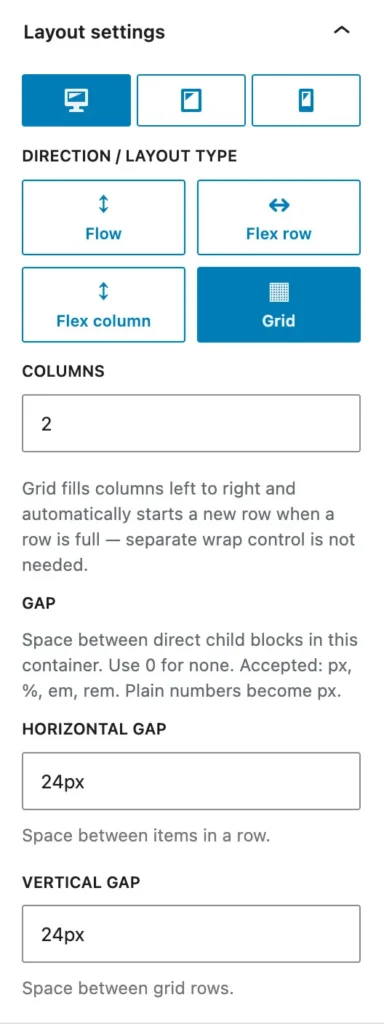
Use Flexible Layout Section to build a responsive two-column layout: side by side on desktop, stacked on mobile. This guide uses the block’s real settings from Layout settings in the sidebar.
What you’ll build: a parent section with two nested columns. On desktop: 2 equal grid columns with matching height. On mobile: 1 column (stacked).
Step 1 — Add the parent section
- Edit your page in the block editor.
- Insert Flexible Layout Section from the WPInsight category.
- Select the new section.
- Set Align (none, wide-width, or full width).
- In the sidebar, open Layout settings.
- Set the Inner content width.
- Make sure the Desktop device tab is active.
- Choose layout type Grid (▦).
- Set Columns to
2. - Set Gap if you want space between columns (for example
24for 24px).
Step 2 — Add two nested sections (your columns)
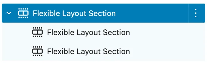
- Inside the parent section, add two nested Flexible Layout Section blocks — one per column.
- Optionally set a background color or padding on each nested section so equal height is easy to see.
- In the next step addd some content in the sections.
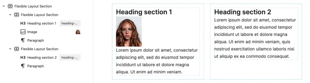
Step 2 — Add content to the nested sections (your columns)
- Inside the parent section, add two nested Flexible Layout Section blocks — one per column.
- Add your content in each nested section (heading, paragraph, image, buttons, etc.).
- Optionally set a background color or padding on each nested section so equal height is easy to see.
Step 3 — Equal height on desktop
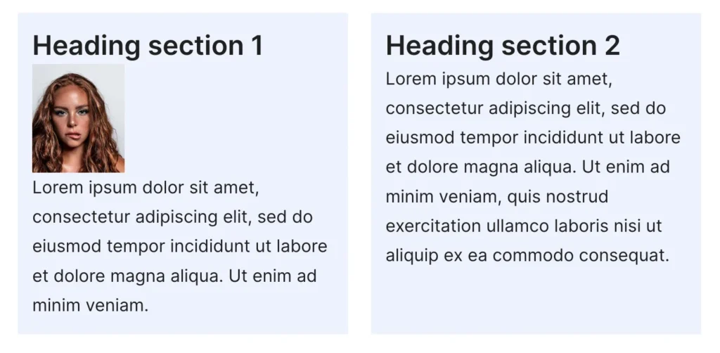
With Grid, both cells in the same row share the same row height automatically — the taller column sets the height, and the other column stretches to match.
If one column has much less content, both nested sections still align to the same height. For colored card-style columns, add background and padding on each nested section.
Alternative (explicit control): For side-by-side columns with the Stretch (equal height) option, use Flex row on desktop instead of Grid. Set Vertical alignment to Stretch (equal height), then set Child width to 50% on each nested section. Mobile still stacks to full width by default.
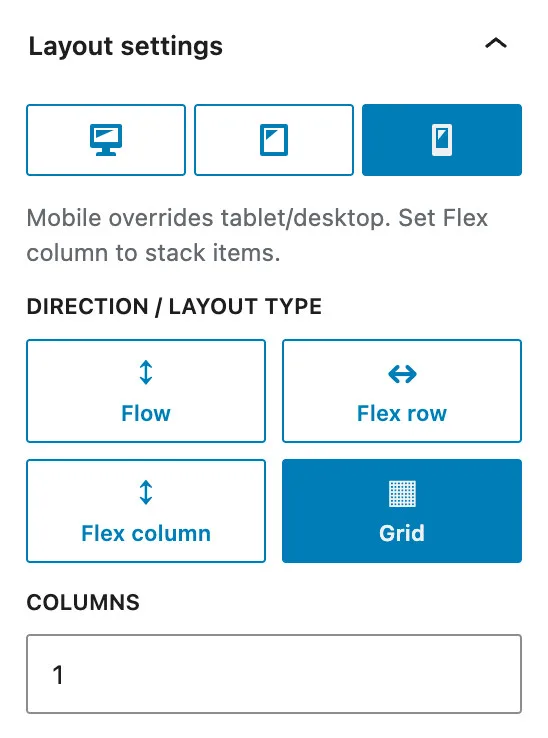
Step 4 — Stack on mobile
- Select the parent section (not a nested one).
- In Layout settings, open the Mobile device tab.
- Keep layout type Grid (or leave as inherited).
- Set Columns to
1. - Update/preview on a narrow screen (or use the editor mobile preview).
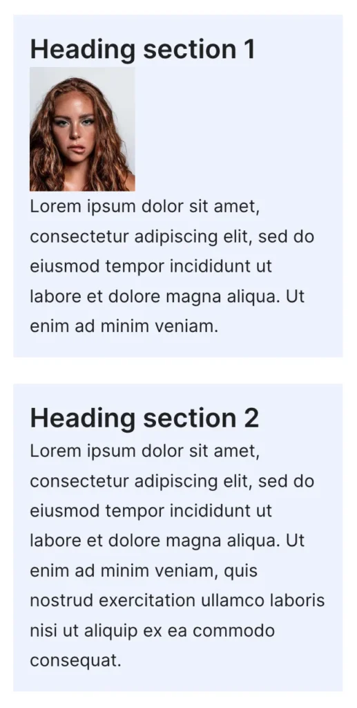
Columns now stack vertically. Nested sections use full width on mobile automatically when needed.
Settings reference
| Viewport | Layout type | Setting | Value |
|---|---|---|---|
| Desktop | Grid | Columns | 2 |
| Desktop | Grid | Gap | Your choice (e.g. 24) |
| Mobile | Grid | Columns | 1 |
| Tablet | Optional | Columns | 2 or 1, depending on design |
Breakpoints are configured under Settings → Flexible Layout Section → Settings (defaults: tablet 782px, mobile 480px).
Tips
- Use a nested section for each column. That way backgrounds, padding, and borders stay independent.
- Keep unequal content in the two columns — grid row height automatically equalizes the height.
- For tablet, use the Tablet tab if you want 2 columns on tablet, but 1 on mobile.
- For flex-based equal height with explicit Stretch (equal height), see the alternative in Step 3.
Two-column grid with equal height (stacked on mobile)
Use Flexible Layout Section to build a responsive two-column layout: side by side on desktop, stacked on mobile. On top of that, we like the buttons to be aligned. This guide uses the block’s settings from Layout settings in the sidebar.
Step 1 — Add the parent section
- Edit your page in the block editor.
- Insert the Flexible Layout Section from the WPInsight category.
- Select the new section.
- Set Align (none, wide-width, or full width).
- In the sidebar, open Layout settings.
- Set the Inner content width.
- Make sure the Desktop device tab is active.
- Choose layout type Flex Row
- Choose Quick Layout 50.50
- Set Gap if you want space between columns (for example
24for 24px).
Step 2 — Add content to the nested sections (your columns)
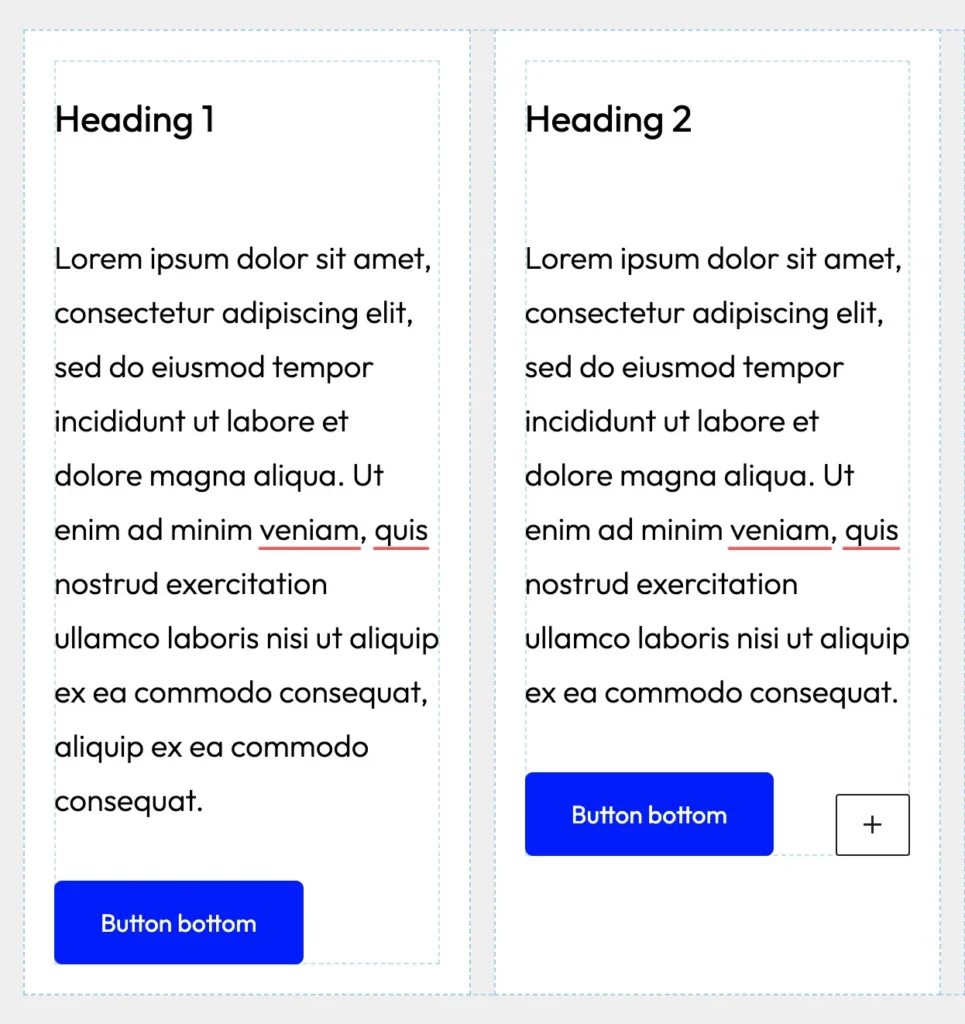
- The two nested Flexible Layout Section blocks — one per column — are already placed by the Quick lay lay-out.
- Add your content in each nested section (heading, paragraph, image, buttons, etc.).
- Optionally set a background color or padding on each nested section so equal height is easy to see.
Step 3 — Equal height
If one column contains less content, it’s better for both columns to maintain the same height. Ensure that the vertical alignment is set to Stretch, which allows both sections to align at equal heights. Usually when you have used Quick Layout actions, this is already done for you. In that case you can skip step 3 all together.
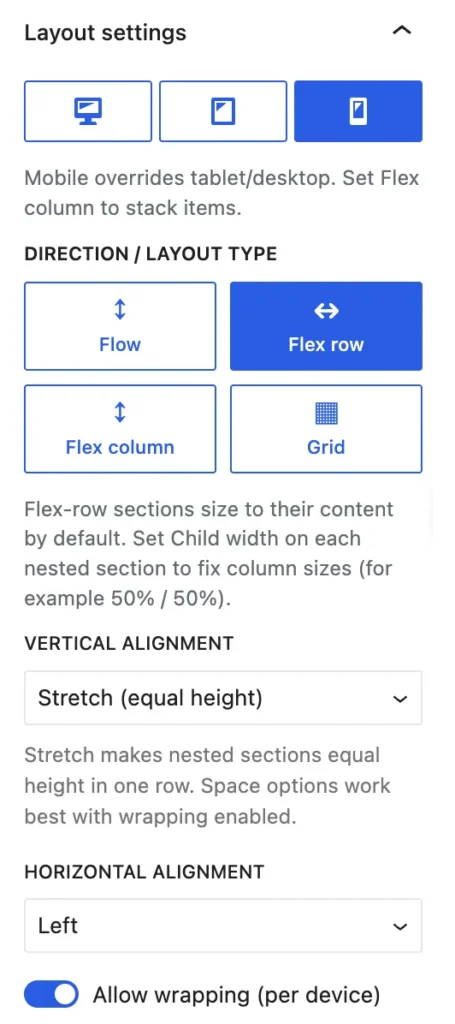
Step 4 — Wrap and stack on mobile
- Select the parent section (not a nested one).
- In Layout settings, open the Mobile device tab.
- Toggle ‘Allow wrapping‘ on.
Columns now stack vertically. Nested sections use full width on mobile automatically when needed.
Note
- You can repeat this for the tablet setting:
- In Layout settings, open the Tablet device tab.
- Toggle ‘Allow wrapping‘ on.
Step 5 — Alignment of the buttons
This is also simple.
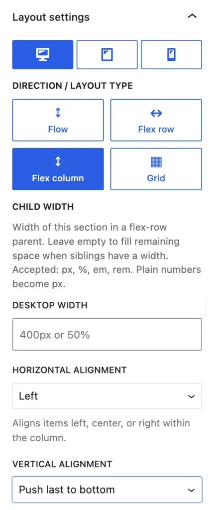
- Make sure each inner (child) column is set to Flex column.
- Go to Vertical alignment.
- Select ‘Push last to bottom‘.
- Repeat this with every child column.
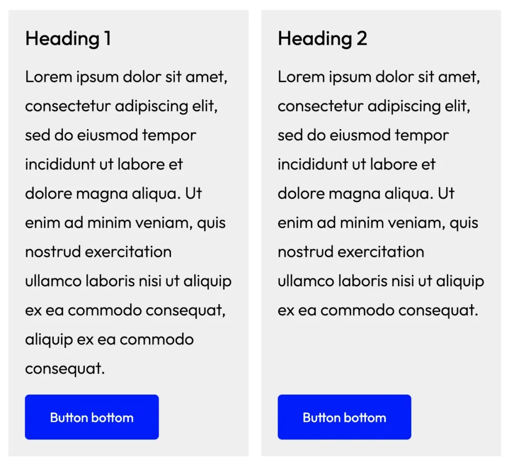
- Now the button (or any other last block in a column) sticks to the bottom of the column.
Tips
- Use a nested section for each column. That way backgrounds, padding, and borders stay independent.
- This is even easier with the grid layout.
Two-column grid with accordions — hide right column on mobile
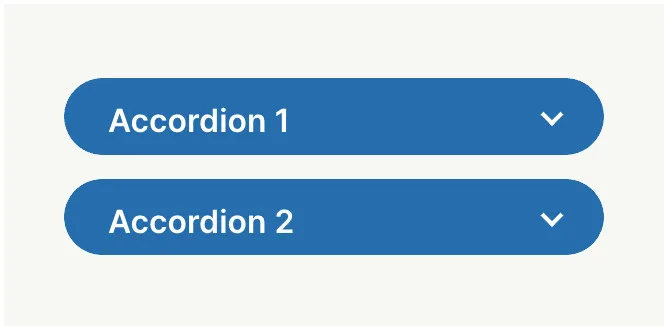
Build a Flexible Layout Section grid with two inner sections. Each section contains a Dynamic Accordion block with two accordion items. On desktop you see both columns; on mobile only the left column (with its accordion) is visible and uses the full width.
Plugins needed: Flexible Layout Section, Dynamic Accordion Block. Hide on mobile requires a Flexible Layout Section license.
What you will build
- Desktop: 2-column grid — left section with accordion, right section with accordion.
- Mobile: right section hidden; left section full width with its accordion.

Step 1 — Parent section: 2-column grid (desktop)
- Insert a Flexible Layout Section block (WPInsight category).
- Select the new section.
- Set Align (none, wide-width, or full width).
- In the sidebar, open Layout settings.
- Set the Inner content width.
- Select the Desktop device tab.
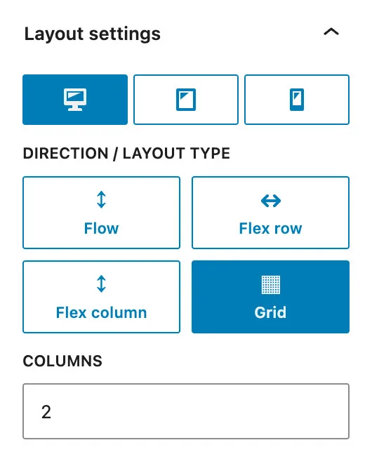
- Choose layout type Grid (▦).
- Set Columns to
2. - Set Gap if you want space between the columns
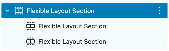
Step 2 — Add two inner sections
- Inside the parent section, add two nested Flexible Layout Section blocks.
- Place the first inner section in the left column, the second in the right column.
- The Flexible Layout Section highlights the inner sections with a blue dotted line, making it easy to identify the columns during the building process.

Step 3 — Accordion in each inner section
Repeat these steps in both inner sections (left and right):
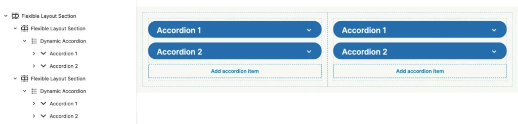
- Inside the inner section, insert a Dynamic Accordion block.
- Add two Accordion Item blocks inside the accordion (via the block inserter or + on the accordion).
- Set a title and content for each item (paragraphs, lists, or other blocks inside each item).
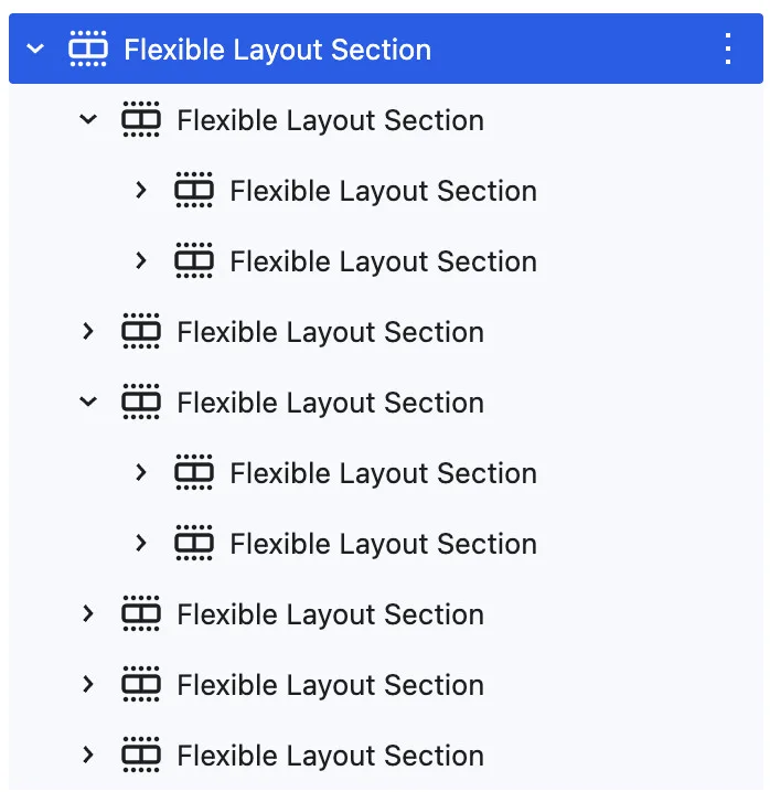
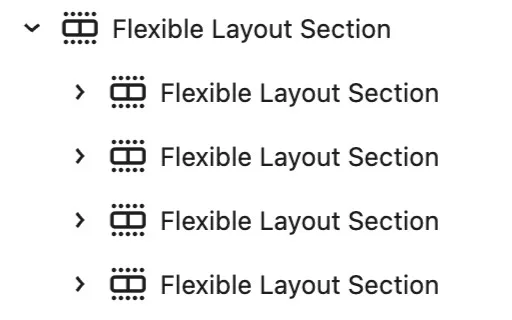
Tip: In the list view you should see a structure like:
Step 4 — Hide the right section on mobile
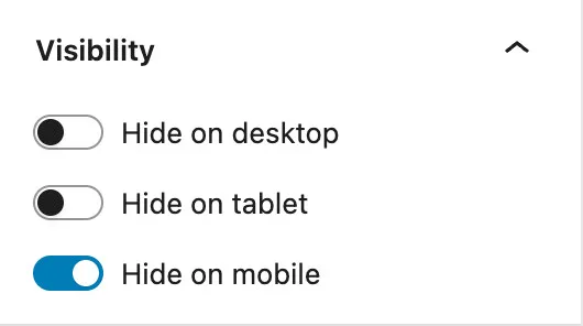
- Select the right inner section (not the parent, not the left column).
- In the sidebar, open the Visibility panel.
- Enable Hide on mobile.
License: Hide on desktop / tablet / mobile is a pro feature. Activate your Flexible Layout Section license under Settings → Flexible Layout Section → License & Doc if the Visibility panel shows a license notice.
Step 5 — Full-width left column on mobile
With a 2-column grid, a hidden right column can still leave the left column at half width. To make the left section use 100% on mobile:
- Select the parent section (the grid container).
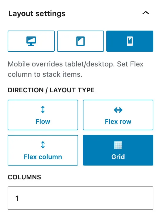
- In Layout settings, open the Mobile device tab.
- Keep layout type Grid.
- Set Columns to
1.
The left inner section then spans the full grid width on mobile. Because the right section is hidden, only the left accordion remains visible.
You do not need a separate mobile width on the left section in this setup — a single-column grid already gives full width. (The Mobile width field appears mainly when a section is inside a Flex row parent.)
Settings reference
| Block | Device | Setting | Value |
|---|---|---|---|
| Parent section | Desktop | Layout → Grid → Columns | 2 |
| Parent section | Mobile | Layout → Grid → Columns | 1 |
| Right inner section | All | Visibility → Hide on mobile | On |
| Left inner section | Mobile | (none extra) | Full width via 1-column grid |
| Each inner section | — | Dynamic Accordion + 2 Accordion Items | Per column |
Tips and troubleshooting
- If the left column looks half-width on mobile, check that the parent has Columns: 1 on the Mobile tab — not only Hide on mobile on the right section.
- Tablet: optionally hide the right section on tablet too (Hide on tablet) and set the parent Tablet tab to 1 column if required.
- Keep accordions inside inner sections (like this example) so each column stays self-contained and easy to hide per device.
- Preview with the editor device preview or a narrow browser window. Breakpoints come from Settings → Flexible Layout Section → Settings (default mobile: 480px).
- Note: Many browsers (including Chrome) are struggling to correctly display the layout on mobile devices, no matter how small you resize it. It’s often essential to use a specific addon or simply to check it on an actual mobile device!
4-column grid with equal height and buttons aligned
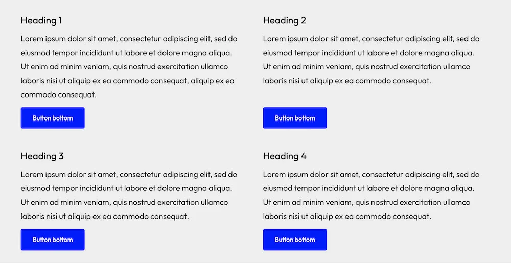
Grid also has an option to align the last block: ‘Push last block to bottom’. This step-by-step example shows how to create it.
What you’ll build: a parent section with 4 nested grid items. On desktop: 4 equal grid-items with matching height. On mobile: 1 item (stacked). This specific example design has a button at the bottom of each grid-item. Although the grid-items have different content, also in height, we want the buttons to align visually at the bottom.
Step 1 — Add the parent section
- Edit your page in the block editor.
- Insert Flexible Layout Section from the WPInsight category.
- Select the new section.
- Set Align (none, wide-width, or full width).
- In the sidebar, open Layout settings.
- Set the Inner content width.
- Make sure the Desktop device tab is active.
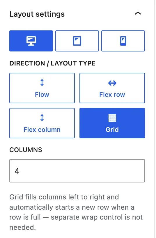
- Choose layout type Grid (▦).
- Set Columns to
4. - Set Gap if you want space between columns (for example
24for 24px).
Step 2 — Add 4 nested sections (your columns)
- Inside the parent section, add four nested Flexible Layout Section blocks — one per column.
- Add your content in each nested section (heading, paragraph, and a button at the bottom).
- Optionally set a background color or padding on each nested section so equal height is easy to see.
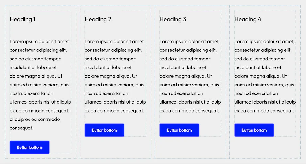
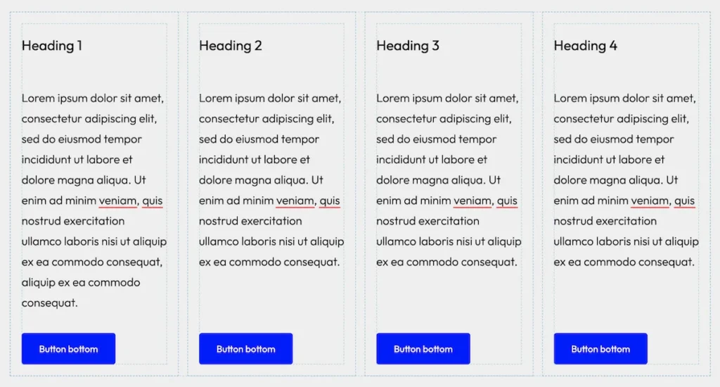
Backend in the editor, it looks like this. As you see the buttons are not aligned.
Step 3 — Equal height on desktop is automatic
With Grid, the sections in the same parent section (row) share the same row height automatically — the taller column sets the height, and the other column stretches to match.
If one column has much less content, both nested sections still align to the same height. For colored card-style columns, add background and padding on each nested section.
Step 3 — Align buttons
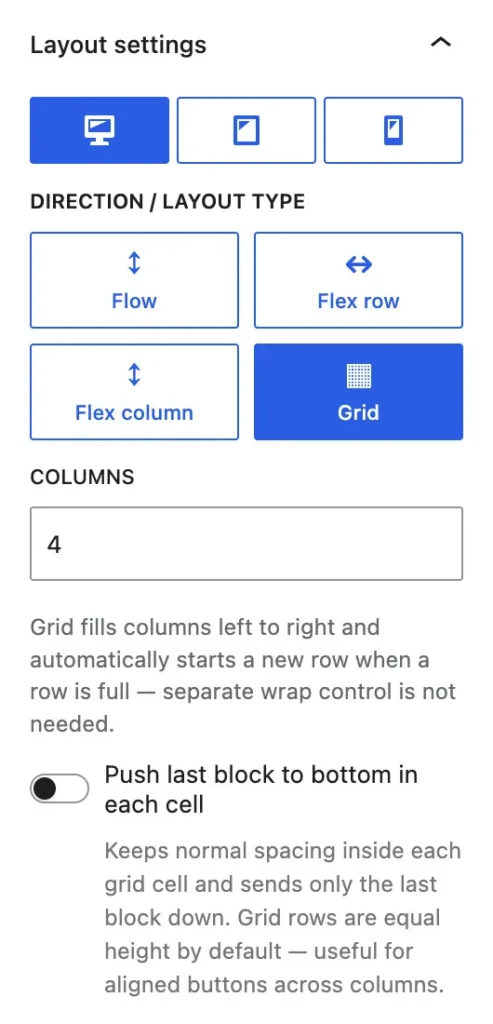
- Select the parent section (not a nested one in the grid).
- In Layout settings, open the Desktop device tab.
- Keep layout type Grid (or leave as inherited).
- Toggle: Push last block to bottom in each cell.
- All buttons move to the bottom of the sections.
- Save
All the buttons are now aligned at the bottom. The last block in the section can be any kind of block, not only a button.
Tips
- Use a nested section for each column. That way backgrounds, padding, and borders stay independent.
- For tablet, use the Tablet tab if you want 2 columns on tablet, but 1 on mobile.
How to create a 70% / 30% column layout
- Add a parent Flexible Layout Section.
- Select the new section.
- Set Align (none, wide-width, or full width).
- In the sidebar, open Layout settings.
- Set Layout to Flex row (not Grid).
- Set the Inner content width.
- Nest two Flexible Layout Sections inside it.
- Select the first nested section → Child width → 70% (Desktop).
- Select the second nested section → Child width → 30%, or leave empty to fill the remaining space.
- On Mobile, set each child to 100% (or leave empty for the default full-width stack) so columns stack vertically.
Optional – same height
- On the flex-row parent, set Vertical alignment to Stretch if both columns should share the same height.
FAQs
Difference active section vs. non active
We believe it is important that the backend layout is as realistic a representation as possible of the final frontend result. However, we sometimes make a small concession in this regard. The reason for this is restraint regarding backend rendering, meaning that not every minute adjustment or click is immediately visible in the editor. This ensures that the section remains lightning-fast and that no (for the developer) annoying delays occur.
This primarily concerns
- Visibility conditions
- Flex alignments when a section is active.
Visibility conditions
- Each condition determines whether a section is shown to the visitor or not. To prevent every adjustment to the settings from causing the rendering to rerun, an icon has been placed, and the color serves as the indicator of whether to show or not. This way, as a developer, you still receive the necessary feedback, but without delay.
Active section
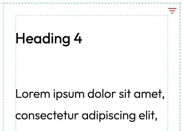
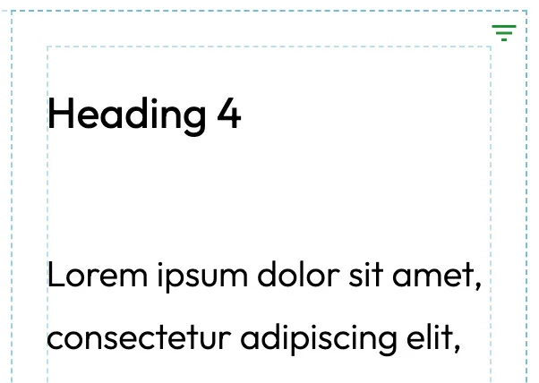
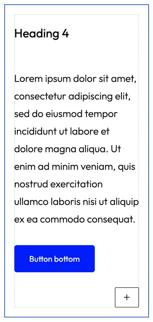
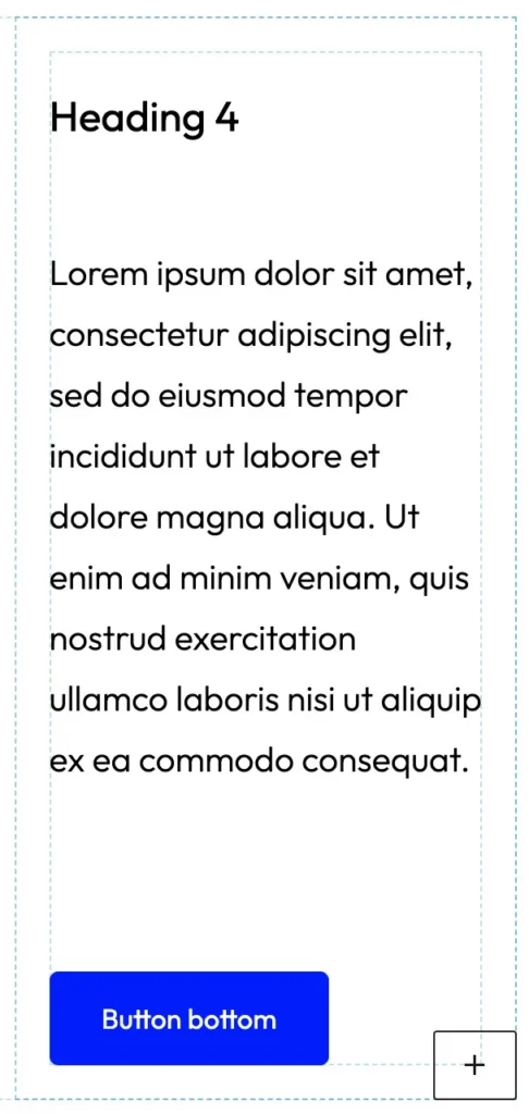
- Flex settings are rendered in the backend. When you activate a flexible layout section, the flex settings are temporarily not rendered. As soon as you click elsewhere in the editor (the section is not active anymore) the flex settings are all rendered again, so you see the realistic representation. For example the vertical alignment setting: ‘Push last top bottom.’
Example
In this example you see a Flexible Layout Section as a column, with a button at the bottom.
First image
The Flexible Layout Section is already set to the vertical alignment setting ‘Push last top bottom’, but is currently active (clicked on). The effect is that the settings are temporarily ignored in the backend.
Second image
The Flexible Layout Section is set to the vertical alignment setting ‘Push last top bottom’, but is currently non-active. The effect is that the settings are fully applied again in the backend.
This is not a glitch but a conscious decision to build a flexible section block without losing speed and efficiency, both in code and the workflow for the developer.
Some builders or blocks are better than others, but it’s never 100%. That’s not possible because:
- The website will be different on every screensize, device and operating system. That’s why we always test a website on a desktop, laptop, two different-sized tablets, an iPhone and Android phone.
- The layout of the editor and frontend screens is different. The editor, for example, has the list view on the left and the block settings on the right. This means that the page must be displayed in a much narrower area than the actual page as the visitor sees it.